PureAura
PureAura
PureAura
PureAura combines nature and innovation to deliver sustainable, natural skincare solutions.
PureAura combines nature and innovation to deliver sustainable, natural skincare solutions.
PureAura combines nature and innovation to deliver sustainable, natural skincare solutions.
B2C
ECOMMERCE
B2C
ECOMMERCE
Brand Strategy
Brand Identity
Brand Development
Brand Strategy
Brand Identity
Brand Development

Project Overview
Project Overview
Project Overview
Oct-Dec. 2024
Oct-Dec. 2024
Oct-Dec. 2024
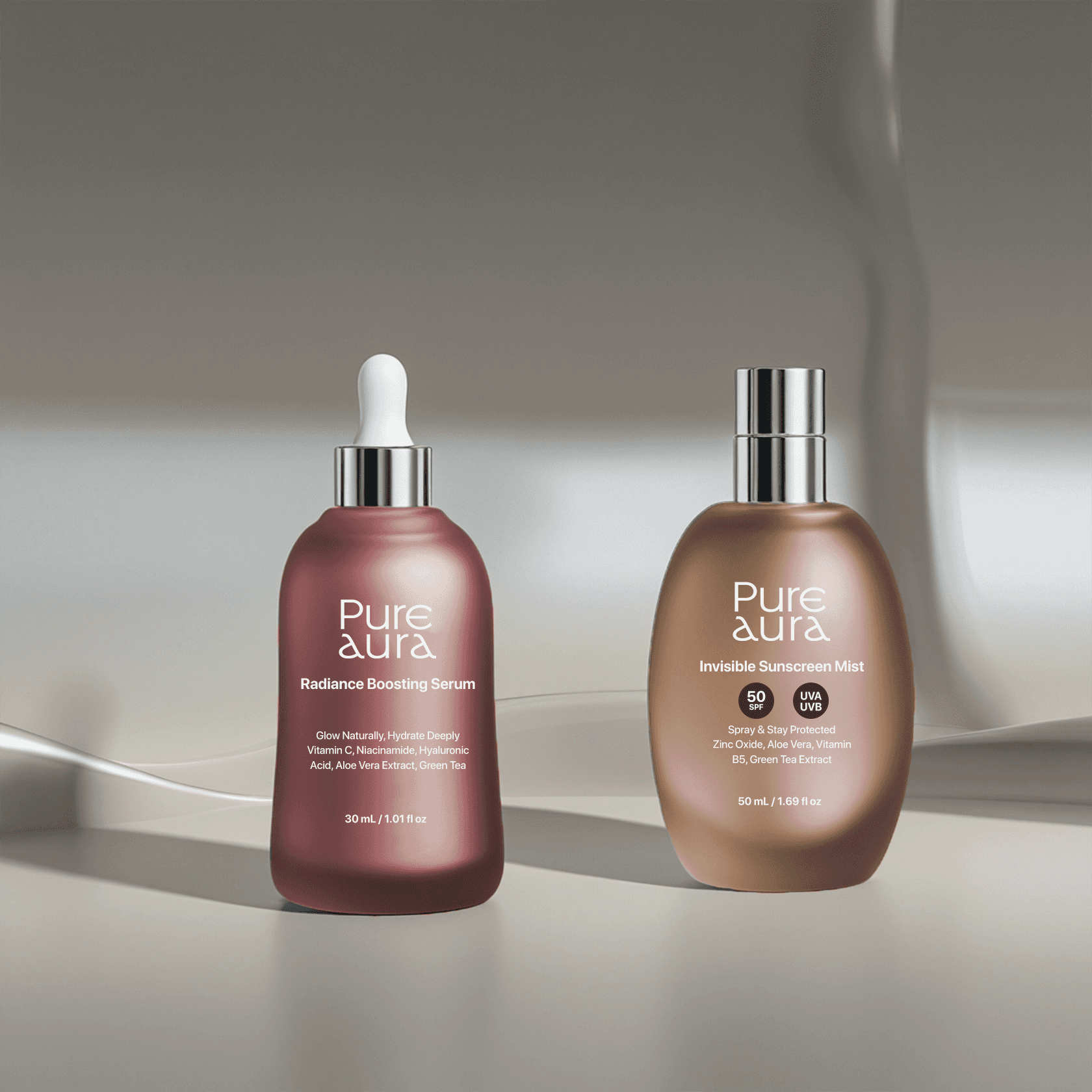
PureAura is a premium skincare brand dedicated to delivering natural, sustainable, and effective skincare solutions. The brand embodies the philosophy of "glowing naturally every day," with a strong emphasis on holistic skin health and eco-consciousness. By combining innovative formulations with sustainably sourced ingredients, PureAura seeks to redefine self-care for individuals who prioritize natural beauty and ethical consumption.
PureAura is a premium skincare brand dedicated to delivering natural, sustainable, and effective skincare solutions. The brand embodies the philosophy of "glowing naturally every day," with a strong emphasis on holistic skin health and eco-consciousness. By combining innovative formulations with sustainably sourced ingredients, PureAura seeks to redefine self-care for individuals who prioritize natural beauty and ethical consumption.
PureAura is a premium skincare brand dedicated to delivering natural, sustainable, and effective skincare solutions. The brand embodies the philosophy of "glowing naturally every day," with a strong emphasis on holistic skin health and eco-consciousness. By combining innovative formulations with sustainably sourced ingredients, PureAura seeks to redefine self-care for individuals who prioritize natural beauty and ethical consumption.
Brand Mark Design
Brand Mark Design
Brand Mark Design
Wordmark & Symbolic Type
Wordmark & Symbolic Type
Wordmark & Symbolic Type
A minimalist and elegant logo that conveys purity and sophistication. Incorporates soft curves and natural elements, such as leaves or water droplets, symbolizing nature and care.
A minimalist and elegant logo that conveys purity and sophistication. Incorporates soft curves and natural elements, such as leaves or water droplets, symbolizing nature and care.
A minimalist and elegant logo that conveys purity and sophistication. Incorporates soft curves and natural elements, such as leaves or water droplets, symbolizing nature and care.

Brand Color & Typography
Brand Color & Typography
Brand Color & Typography
Basic Graphic Toolkit
Basic Graphic Toolkit
Basic Graphic Toolkit
Brand color and typography are fundamental and powerful design elements that can effectively represent images of curves, requiring the use of corresponding palettes and typography for consistent brand image delivery. PureAura’s color system is dominated by 'PureAura Red, which contains a lyrical mood in the red section representing trust, and the sub-color consists of a neutral palette that can assist the main color. In addition, typography enhances the brand identity by utilizing the 'SF Display Pro' typeface, which resembles the brand wordmark, as a visual type.
Brand color and typography are fundamental and powerful design elements that can effectively represent images of curves, requiring the use of corresponding palettes and typography for consistent brand image delivery. PureAura’s color system is dominated by 'PureAura Red, which contains a lyrical mood in the red section representing trust, and the sub-color consists of a neutral palette that can assist the main color. In addition, typography enhances the brand identity by utilizing the 'SF Display Pro' typeface, which resembles the brand wordmark, as a visual type.
Brand color and typography are fundamental and powerful design elements that can effectively represent images of curves, requiring the use of corresponding palettes and typography for consistent brand image delivery. PureAura’s color system is dominated by 'PureAura Red, which contains a lyrical mood in the red section representing trust, and the sub-color consists of a neutral palette that can assist the main color. In addition, typography enhances the brand identity by utilizing the 'SF Display Pro' typeface, which resembles the brand wordmark, as a visual type.


Graphic Language
Graphic Language
Graphic Language
Brand Visual Grammar
Brand Visual Grammar
Brand Visual Grammar
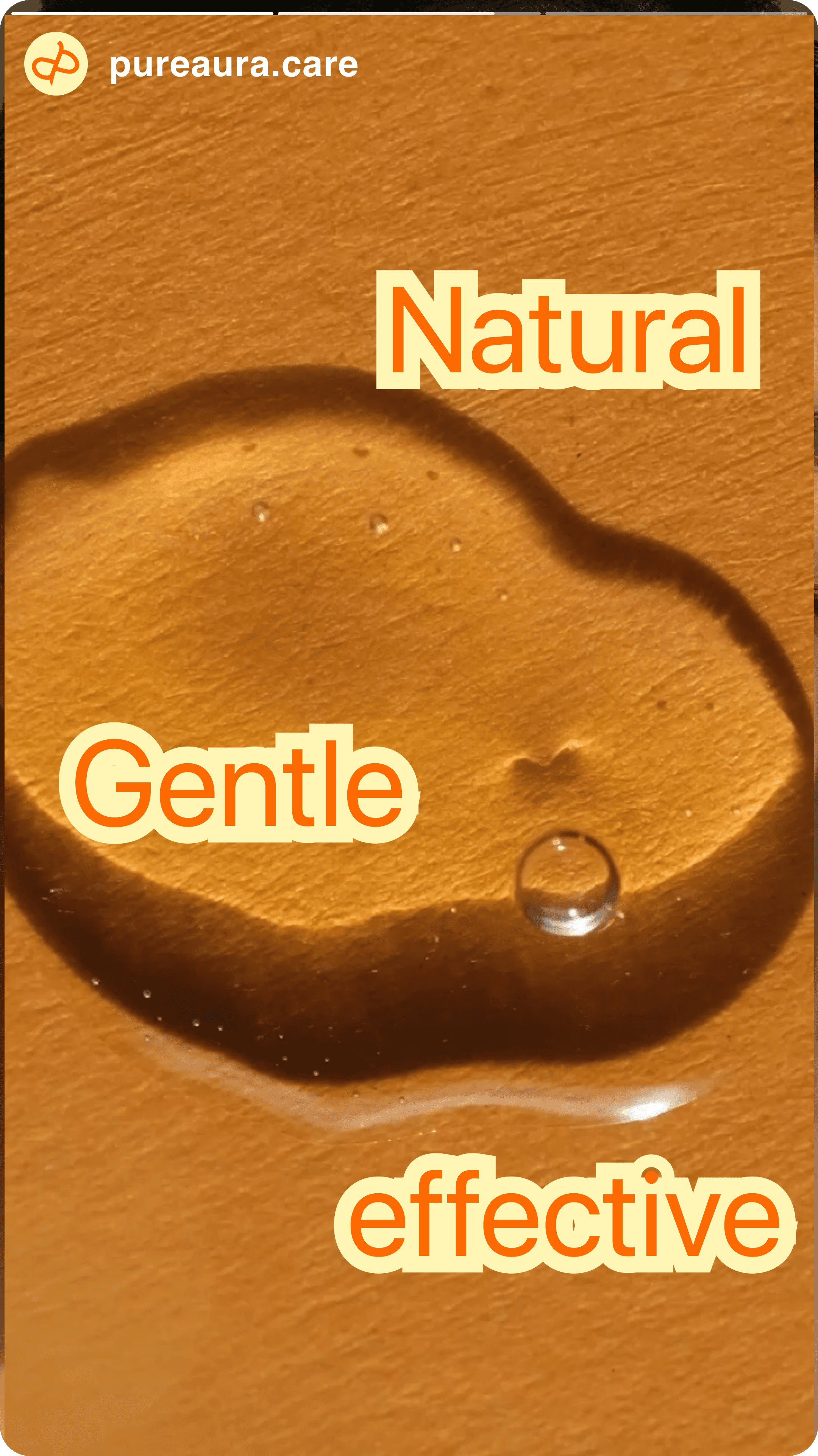
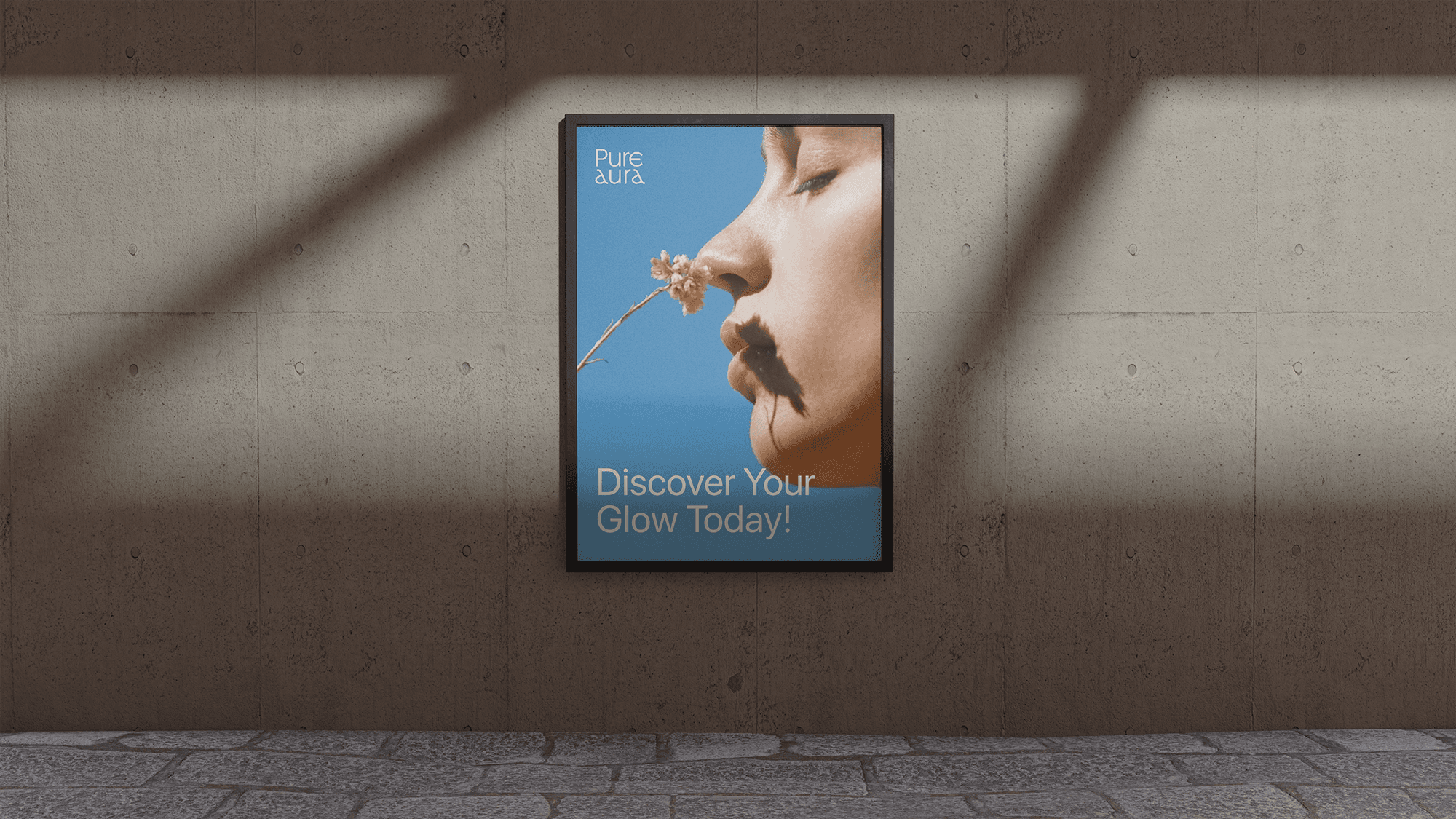
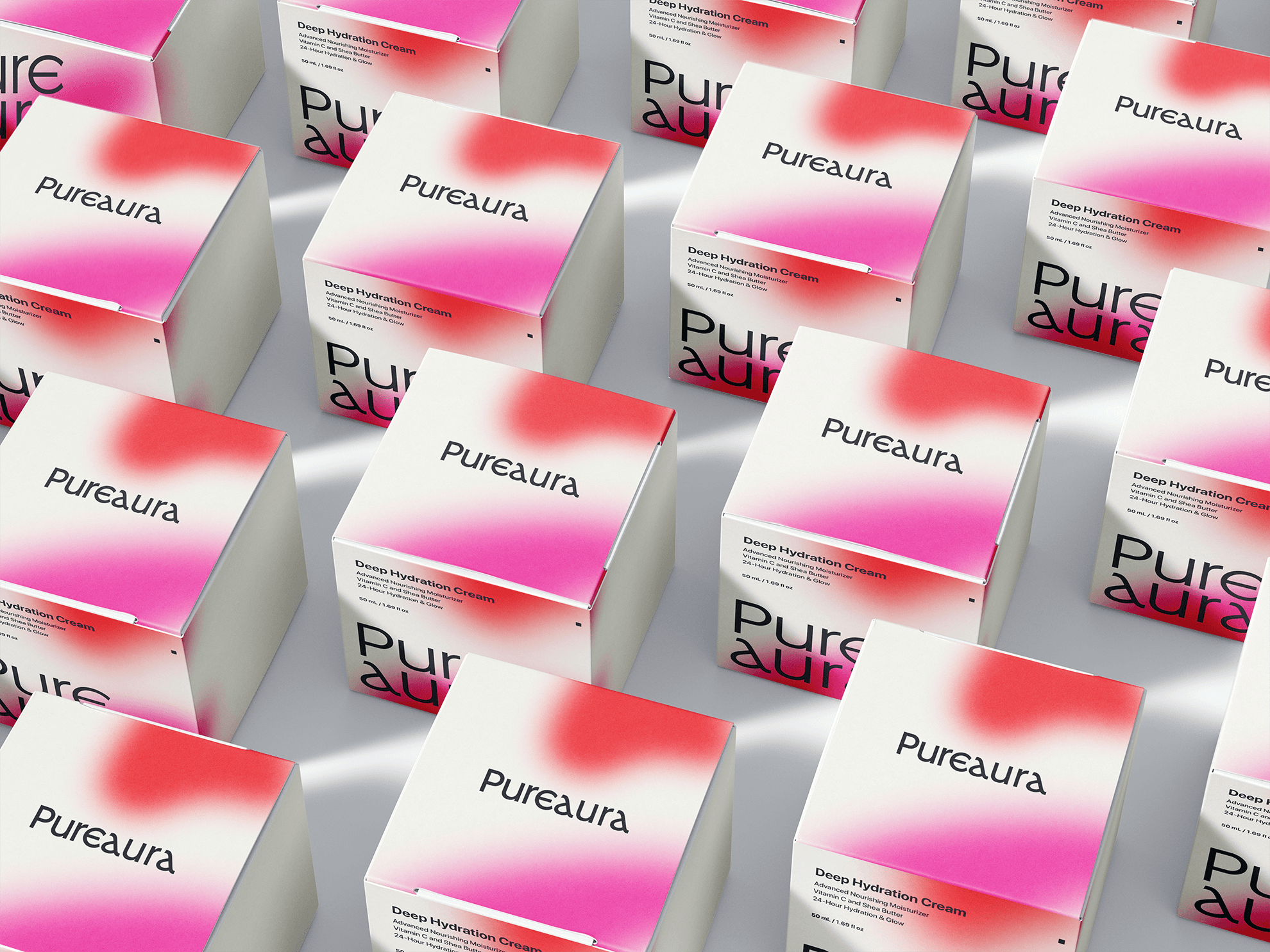
The brand's graphic language intuitively uses our core keyword, the aging inflection point, and allows you to utilize graphics that have variations tailored to your environment. This is a consistent representation of the brand's direction and value through core motifs. The graphic type consists of the symbol type used like the face of the brand along with the word mark, and the graphic type and info type that can be used on the brand side. Use the type that suits the environment you want to apply among the three graphics, but aim to bring the brand image in a uniform manner.
The brand's graphic language intuitively uses our core keyword, the aging inflection point, and allows you to utilize graphics that have variations tailored to your environment. This is a consistent representation of the brand's direction and value through core motifs. The graphic type consists of the symbol type used like the face of the brand along with the word mark, and the graphic type and info type that can be used on the brand side. Use the type that suits the environment you want to apply among the three graphics, but aim to bring the brand image in a uniform manner.
The brand's graphic language intuitively uses our core keyword, the aging inflection point, and allows you to utilize graphics that have variations tailored to your environment. This is a consistent representation of the brand's direction and value through core motifs. The graphic type consists of the symbol type used like the face of the brand along with the word mark, and the graphic type and info type that can be used on the brand side. Use the type that suits the environment you want to apply among the three graphics, but aim to bring the brand image in a uniform manner.